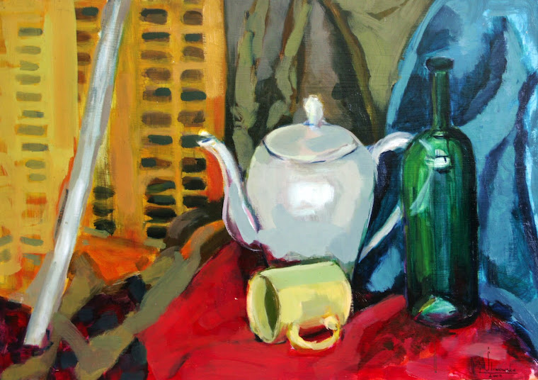
still life nr1

still life nr1

Friday 31 December 2010

drawings of flowers

drawing 1
This is project 3 stage 2, drawing a few flowers. I used charcoal thinner than before and to be honest I found it much easier to show details.  I haven’t made a decision which one I’m going to put in my portfolio but I still have time for this.
drawing 2
drawing 3


I know that it should be a sketch but I am concerned that sometimes my objects seem to float in the middle of the page.  Sometimes I don't know if few lines are enough to describe a space.  I hope the simple lines in the background are enough.
 

Sunday 5 December 2010

Using Colour to describe Object

Project 1.  A Colour Study


In this project focus on colors, on how I can utilize them to define a block. This will be quite a challenge since that I have a pattern of images Frank Auerbach who is well know how to use the broad brush strokes in the image.


Frank  Auerbach


When I look at the first stage of my work, I see a few places over which I have to work on. I pointed them in the drawing No.2. I want my second plan paint with rapid brush strokes and the color was vivid and clear. Another thing which bothers me, is the color of tangerines, it is not clear enough.

Monday 25 October 2010

CHAPTER 2: COLOUR THEORY AND PRACTICE

PROJECT 1:”Colour Mixing”
Stage 1: Mixing Colours
In this project I have been asked to paint each primary colour (cadmium red, cadmium yellow, ultramarine) at the top (one about 4cm square), the colour must be clean, unmixed, straight from the tube.  Below them are three groups of five squares of colour, the orange is mixed from yellow and red only, the green from yellow and blue, and the third from blue and red.


Stage2: Adding Black or White to Colours
As I have my first stage completed, the next step was to take a colour from each of the three groups of colours from above.  Orange with a very small amount of black for the top square, I was continuing adding black until I have reached almost black.  The same process was with white colour.   


PROJECT 2: “The Colour Circle”

This little project shows colours in a circular sequence that corresponds with the order of spectrum colours that make up white light.
1)      Cadmium Red +Crimson
2)      Cadmium Red
3)      Cadmium Red +  Cadmium Yellow
4)      Cadmium Yellow
5)      Cadmium Yellow + Lemon Yellow
6)      Lemon Yellow
7)      Lemon Yellow + Cerulean Blue
8)      Cerulean Blue
9)      Cerulean Blue + Ultramarine
10)   Ultramarine
11)   Ultramarine + Crimson
12)   Crimson

Through this project, I could find out more about complementary colours, which we call colours opposite to each other.


PROJECT 3: Tone, Saturation and Contrast
Stage 1: Tone Values
On the grid in the left hand column, I used black and white to gain grey.  Then, on another piece of paper, I painted twelve squares using colours from the previous project.  Next, I cut them out and matched the lightness or darkness of the colour against the greys.
When I look at my finished project, I see I made a mistake in the first column of grey under the white, there should be only one yellow, and I should leave lemon yellow only.  However, I am pleased with the rest of my decision.


Stage 2: Saturation
Just like in stage 1, I have to take two colours and merge them, this time red and green, yellow and violet, blue and orange.
I was very surprised how the redness comes through, even in the middle of mixing yellow and violet the result is obvious.


PROJECT 4: How colours affect each other
This was my favourite exercise so far.  I had to make sets of three squares, paint the small squares in the same identical colour.  In one set the small squares grey, but the others should be any colour I wanted.
Colour theory says: that warm colours appear to advance to the foreground in a painting and cold colours to recede to the background, I can say it is true.  It is easy to see on those grids:


I wanted to check what would happen when the small square is cold and the big one is cold temperature. I may say that darker colours always come to the foreground.  When the small square is cold and the big one is warm temperature, the warm comes to the foreground.  It was a bit different when I used warm temperature in both squares; darker colour comes to the foreground.  As I saw with the yellow small squares, they came to the front while the cold big squares stayed in the background.  Although there is a different with grey colour, it is so powerful that in most cases will appear to the foreground.

PROJECT 5: Optical Illusions
Stage 1: Optical Mixing
When I mixed small dots of yellow and blue next to each other, I suddenly saw green.  When I did the same with reds and yellows, I saw orange.  The last stage of this task was to check what would happen with red and blue, to my surprise it appeared to be violet.

Stage2: Inducing Colours
For the task I bought a light grey A2 size paper, I painted a cross (about two cm thick) at the top of the paper.  As I was concentrating on looking at this red cross for more than thirty seconds my eyes believed that the cross was green.
Stage 3: What have I Achieved?
After all projects and exercises with colours, I feel more confident how I should use them.  My knowledge about complementary colours, hue, and saturation has definitely improved so I can use that in my next work.


Sunday 24 October 2010

I was trying to find the best point in my room to make the right sketch, after a few changes I think I found the one I like.  I decided to take the one where I was looking at my composition from above that gives a nice and interesting angle.
I was ready to make a final selection for development, confident of my choice.  I couldn’t wait to make a painting as I knew that then I would have more space on A2 format. As much as I liked charcoal and the way I could smudge it, at the same time I found it very difficult to make a good drawing on A4 paper.

PROJECT 2: From Drawing to Painting”
Stage 1:  Painting With a Limited Palette
At this stage, I used a limited range of colours, black, white, and yellow ochre.  For the last few years, I followed the Impressionism rules of choice of colours, where greys and dark tones are produced by mixing complementary colours.  In pure Impressionism the use of black paint is avoided. I was terrified before I started this project, I thought it would be more difficult for me to break my main rule. When I was making the outlines of the main shapes of the objects with a small brush and black paint I got goose pumps on my skin.  After a while I got to used to that pure black and to my surprise I found it quite interesting. I began to paint the shapes between objects revealing the negative shapes.


Stage 2: Developing the Painting
Now when I have my positive shapes so visible white I started to paint each of them with an individual single colour and tone.
Stage 3: Considering the Design
I decided to chose the part of my painting where I saw different directions in my composition, more interesting for an observer. Where a shoe is pointing right, scissors are placed in the bottom-right corner and the left- bottom space is filled with a small glass and long sculpting knife.  I like the empty space between the scissors and shoe where the eye can catch a breath.


Stage 4: What Have I Achieved?
When I asked myself were there any better viewpoint than the one I chose, sadly I have to say that the space in my art studio is limited therefore my painting could be made only from a few angles. At the same time I am happy with my choice.
Did I choose the best drawing to develop?  Yes, in my opinion I did. I like this composition as much as I like the way I draw the line and the way I smudged places which should be smooth.
Did I use only four tones in my charcoal drawing? I tried to stick to only four but have I achieved that?  I hope I did.  I have pure white, then darker and more darker tone with big contrast of black.
Would I change any of the tones in my drawings if I started again? Definitely I would like to change the round bottle in my drawing number 4 as is too dark.


Sunday 26 September 2010

Extending a drawing

Next stage of that project was to pick one of my small drawings, than extend a drawing by adding to it another one or two different objects.
                                        
 This is my extended drawing .
 At the end of this stage I have to admit that a charcoal is a very difficult medium if you would like to create a drawing full of details on a small paper format as A4 is.
Now I am ready for project nr. 2 “From drawing to painting”


Thursday 23 September 2010

Hi to all of You

This is my first post of my OCA Learning log. I am very excited that I can share my thoughts and every step of my learning process with You .
As my first project I have been asked to choose five objects around my home . That could be anything as long as it has an interesting shape and bright colour. I decided to put a high heel shoe, a bottle of perfumes, a bag, a plum, and a chopping board on a table . All of my objects look so bright in the day light that it makes them even more interesting . I have been given an charcoal as my medium for this project . An to be honest with You that was the ‘scary ‘ part for meJ J as I have never used a charcoal before. I like to draw with a pencil ,usually 2B or 3B as I can concentrate more on lines . This challenge got more exciting with every drawing.
And this is a result of my first exercise with that medium. Drawing 1 took me 18 min, drawing 2 -22min , drawing 3 -26 min. and the last one 17 min.
   drawing  1

drawind 2

drawing 3

drawing 4
                                           
Now I have to make a decision which one is going to be my base for project number 2 ….. I think I will go fore number 3 J ??