still life nr1

still life nr1

Tuesday, 5 July 2011

7 : Painting from Photographs and Studies

Project 1: Painting from Working Drawings 

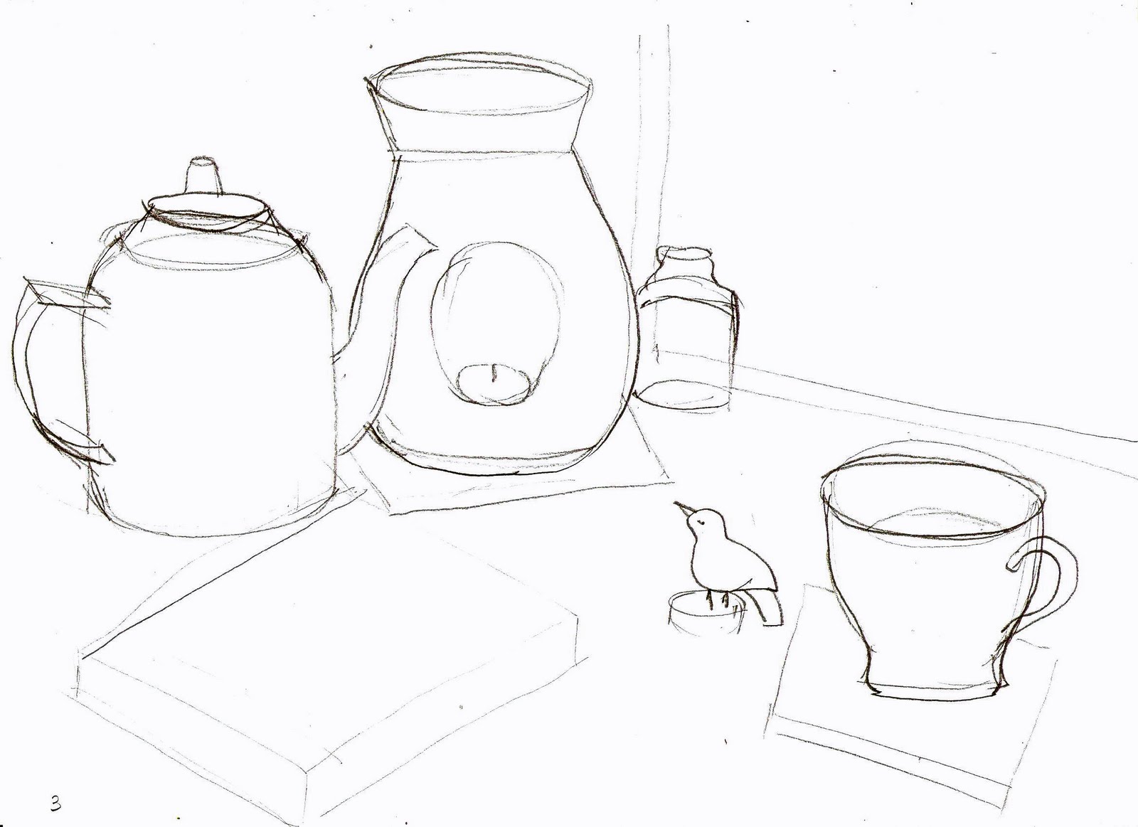
Stage 1 : Drawing Shapes

I placed on my desk a few objects of different shapes and sizes. I used only 2B pencil to do these drawings and I spent about 30min on it.
Stage 2 : Tones and Brush Marks


This is a more important stage for making notes about tones and light. This is going to be more helpful as a study for my final painting therefore i decided to spent more time making it. I have used thin charcoal on A4 paper.

Stage 3 : Colour


This is a very difficult stage for me as I used acrylics for the first time. I have some problems with making the right choice about tones and colours....well:) the shadows are supposed to be warm and the lights cold.


                       But to help myself a bit more I have done some sketches in my sketch book:
 

Monday, 2 May 2011

Stage 2: The flexible approach

part 3


There we are.  I have finished my painting. I kept pastel colours and  the temperature of the colours is warm.  The layer of paint is thick where the lemon is. There is a contrast between cold blue glass and dark brown and warm box.
The composition looks nice and playful but is missing something  in the middle of the box. I do not know what could I do to make this composition more interesting.

Tuesday, 19 April 2011

Stage 2: The flexible approach

Stage 2: The flexible approach
part 2


I took a photo of my composition (iii) where a large single ‘empty’ area contrasted with smaller complex areas. Here we have a small lemon on the big box.


I am nearly at the end of my assignment but still behind the schedule. That makes me even more agitated and wanted to produce better work.  Stressed and excited- this is how I fell about this project now. I still have another task to do which is from Chapter 6 Composition Project 2 Geometry.

To comeback to my lemon and the box, I know that I am at the beginning as this is just a tonal sketch.  I will try to keep it as light and bright as possible.


Stage 2: The flexible approach

Stage 2: The flexible approach

On A2 size paper there is a big flower vase painted with oil paints.  Colours are bright with a big amount of toned down yellow.
  
             
The way I painted the wall area is different to the glass vase, that was a challenge for me.  I used a bigger brush for the wall with more paint on it.  For the vase I used less paint with more white spirit to make the paint layer thinner and lighter.  I also used a smaller and thinner brush for leaves and flower stems.


The flower looks warm but there is a big value contrast between the yellow wall and cold green leaves.  At the same time the yellow flowers nearly disappear into the yellow wall.


Sunday, 17 April 2011

Project 3: Composition in practice

Project 3: Composition in practice

Stage 1 - using preliminary studies

The medium I used for this task was charcoal on A3 paper. 

My sketch number one is based on the description where composition has two or more horizontal or vertical lines cutting across the whole painting.

The two vertical lines which are the edges of the vase are running up the painting.  I can see many more than two vertical lines on this picture, like flower stems or a big shadow line on the left side of the page, although the two lines of the vase are the strongest ones.


The sketch number two on A3 paper shows a composition with a large single ‘empty’ area (a big box) contrasted with smaller complex areas (a lemon).  One third of the painting surface should be a simple area like a table top, a large section of floor etc.  I decided to make my composition as simple as I could.  I put a lemon on the big box and placed that in front of the window.  I placed the lemon more on the right side of the picture so it does not have to drag the eye in the middle of the page.


Project 4 – More than 1 view points Part 3

Project 4 – More than 1 view points
Stage 4
Part 3


This is the last part and my painting is finished.  I am very pleased with the result.  The colours are very bright and have got a lot of white mixed together.  I could say they are broken colours.

The first sheet of paper is full of pastel yellow and pastel green.  I finished it when the daylight was strong.  There is plenty of free space therefore an observer has time to catch the breath.


The middle part is more complicated and in this way more interesting.  I finished it during the evening with a lamp light and the shadows are strong, colours are sharper and crisper; still broken, pastel colours but the brown carpet was painted with a smooth brush which did not leave any marks.


I had a more complicated task with the plastic bottle, although I hope I captured the transparency of that object.
The paint is thick especially on the purple rug. The colours are different as I used some warm greens contrasting with cold violets. On the right side on the green rug I used different brush technique, bit more blurry to show which off the rugs is first and on the top.

Chapter 6, Stage 2 – In Colour

Stage 2 – In Colour 


1 – Rectangle one is 20cm x 15cm.  The space was divided by lines from XXXXX to XXXX.  The in the space between lines I filled with curves.  There are two colours, black and dark blue.


rectangle 1

2 – Rectangle two is very long and horizontal.  There are horizontal and vertical straight lines which divide it into smaller rectangles and squares.  This is a very interesting composition where the cadmium red rectangle in the top right corner drags attention towards it.  Then we have a cadmium yellow rectangle in the bottom middle part,  This is a great example of colour interaction, where different tones of grey work sometimes weaker when they are surrounded by warm colours.  This is what I remember from Chapter 2, project 4 “How colours affect each other”.

rectangle 2


3 – Rectangle three is quite big with lines and curves.  My selection of colours is an orange with complementary blue.  Then yellow with complementary purple.  A big variety of shapes and colours makes this rectangle very visible, however with a balanced composition.

rectangle 3


4 – Rectangle four is quite a small size with cadmium red and ultramarine, one third of the area is white.  All curves make this composition very lively and it looks like it is moving from the left side to the right.

rectangle 4


5 – Rectangle five is a compilation of lines, rectangles, triangles and squares.  There is a small circle or rectangle in each section.  The selection of different greens goes well with contrasting lemon yellow.  To balance the composition I used a big black rectangle on the right side,

rectangle 5


Overall the composition starts from the bottom left corner and carries on across the middle part of the A2 sheet.  Then straight down the right side.


Project 2 : Geometry 

Stage 1 : Hidden Geometry 

     a) 'Crucifixion ' - Andrea Mantegna


b) ' Madonna of Mercy' Pierro della Francesca


 c ) 'Birth of Venus ' Sandro Botticelli


d) 'Martyrdom of St. Sebastian ' Antonio Pollaiuolo


Stage 2: A Geometric Grid


composition1


composition 2


composition 3