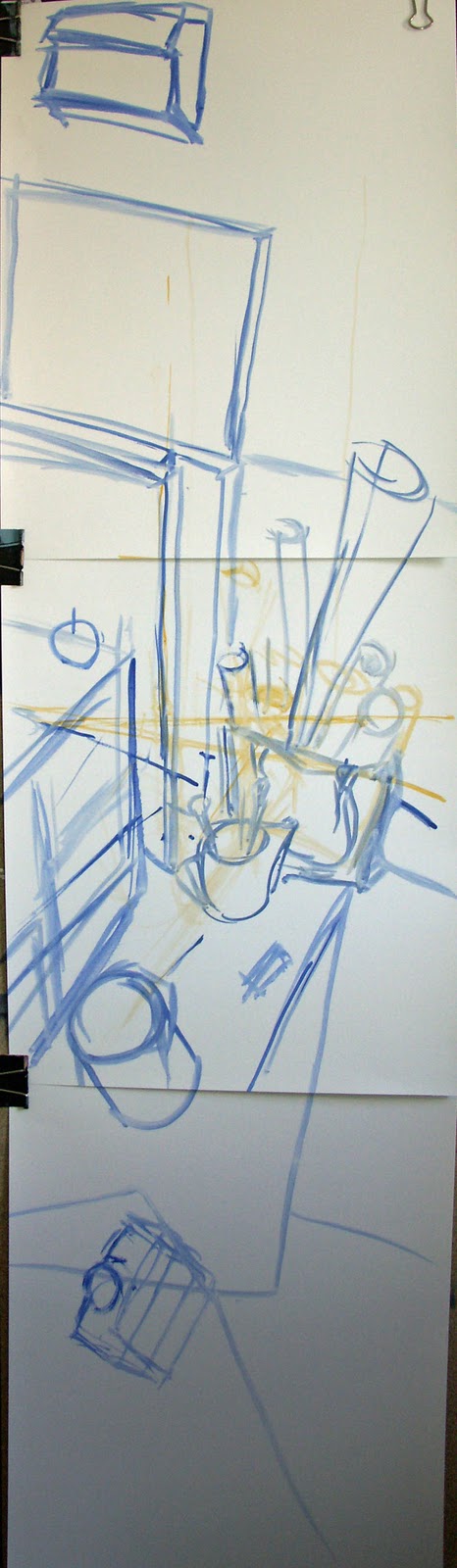
still life nr1

still life nr1

Monday, 4 April 2011

Chapter 6: Composition


Chapter 6: Composition
Project 1: The dynamics of the rectangle
Stage 2 – Black & White


rectangle1


1 – Rectangle one is one of the biggest on the A3 sheet.  Inside of it are small dots, filling up the space.  The composition in that one has been designed to draw attention to the top left corner.  I have done this by playing with the spaces between the dots to create movement in the rectangle.
         
rectangle 2


2 – Rectangle number two is divided with lines in a vertical way.  I placed my first line just about in the middle of the rectangle and then added some lines on the opposite sides.  I hope I achieved the visual balance and there is a three-dimensional effect.


rectangle 3

3 – Rectangle three with the straight lines that run vertically across from one side to another.  The space between each one is filled with small curves, which give a well balanced effect.  I think I have achieved this visual ‘trick’ as it looks like a curved piece of corrugated cardboard.


rectangle 4

4 – Rectangle four: there are lines across from left to right and the gaps between them are filled with curves.  Some curves are painted with black ink, but most of these black parts are not touching each other.  The composition is well balanced but not too symmetrical.


square 5

5 – Square five is a compilation of all possibilities from all four previous rectangles.  My lines go from one side to another across the space.  Then we have some curves, big and small.  I decided to paint a few big shapes with black ink, then some small lines and dots to make this square more interesting.  We have a selection of sharp shapes and smooth curves.  This keeps the square dynamic as there is no symmetry.


Overall the A3 sheet looks spacious as I tried not to place any of my rectangles in the middle of it.  The empty space in the middle is planned and the dots in my first rectangle are supposed to draw the eye to them.  None of my five rectangles are touching each other.  In my opinion this is a composition starting from the top left corner then going down to the bottom left part and then following the black triangle sections of square five up continuously to the top-right part.  Another movement is from the top right going down until rectangle two and finally right off the page.


part 2


Part 2
At this stage of my work, the colours are not specified yet.
 Some parts are still white and not painted. This is still an early stage where everything can go in a different direction.  So far, my basic colours do not show the potential of my project.  Even the shapes are not specified yet, still flying above the floor.  However, it is all being improved with every step.


Thursday, 31 March 2011

Stage 4 painting from two or more viewpoints

Stage 4 painting from two or more viewpoints.
Part 1
I decided to paint my first study drawing.  At this stage, my painting has an open composition.
This is only a sketch painted with one yellow paint and one more visible blue one.
I did not want to have such a limited amount of space in this project; therefore, I decided to add another bottom part to this painting.  I wanted to have a space to catch the breath, where the composition is less claustrophobic.  I think in the way that parts of my work shows a different perspective.  The plastic bottle viewed from a different angle than the bag with the paper rolls in the middle of my sketch.  The lines in the floor make this work very interesting as they build a geometrical journey for an eye.


                                                       My art studio from 3 different perspectives


This is a great exercise for me after studding a few of Cezanne’s paintings like: ‘Still life with a ginger jar’, ‘Still life with Peppermint’, ‘Still life with Plaster Cupid’ or ‘Still life with Apples and Peaches’.  All of them show still life, however all are based on the same rule, they are painted at the same time but from different perspectives.


    ‘Still life with a ginger jar’


    ‘Still life with Peppermint’

     ‘Still life with Plaster Cupid’


Still life with Apples and Peaches’

Project 4 more that one view .

Project 4 more that one view.

Stage 2 scanning vertically.

I started this stage on A3 format but that was not enough.  I decided to add another A4 paper to continue a bottom part of my drawing.
To make my composition more interesting I tried to fit all parts of that room, with wall, fool and ceiling.  Moreover, I decided to take a corner of that room as an object of my drawing.  This is a very exploring task for my eye to observe.  Hope I manage to catch this room from few a different perspectives.
I used a 2B pencil to draw this task.
I could not draw more shadows as there was no strong sun on that day.  When I was drawing, I realised that this is an interesting subject for my next painting.


Stage 3 Drawing from right to left.
Just like in stage 2, I started this drawing on an A3 sheet of paper, but it was necessary to extend from both sides.  Therefore, A3 is the middle part and A4 from left and right side.  Again, I used 2B pencil.  This is an open composition but not as exciting to the eye as my previous one, I think.  Maybe the reason for that is I was too close to both sides.  However, there is a good part in my opinion.  The right side with the window and nice day light gives a place to play with light and shadow.
Should I use this as a subject for my next painting?


Wednesday, 30 March 2011

matisse


I did some sketches in my sketchbook from where I was sitting.  That was a very interesting task as I could understand Matisse more than I thought before.
This are a few Matisse's paintings which I like the most for their expressive and interesting look.

project 2

painting 1

painting 2

painting 3


Project 2 looking form one space into another.

The painting 1 is focused on day light, how it affects the others objects in the room.  The light makes the carpet lighter than it is; the walls are more yellow in the part where the sun shines.  There is a contrast between the dark doorframe and the light ceiling.  All colours are bright which make this painting very cheerful.  I used pastel colours where the light interacts with the objects.  However, where the shadows play the main part I used only clear colours without white paint.  This is a painting with different tones.
The composition is open and in the central of it, I painted a very dark chair contrasting with the light, warm yellow wall.  At the same time, an observer’s eye may be drawn to a bright, warm orange vase with purple flowers.
I did not use a thick layer of paint; I tried not to paint too many layers.  I hope that I managed to achieve a very light paining.

Painting 2 is again a painting from one room into another.
The composition is open, as the bottom, part is not closed with any object and the top left corner with the window.
This is a painting with fewer days light than the other one, therefore the space feels heavier.  The walls, carpet and the door look very dark and gloomy.
I used less white paint as there is very little day light falling into this room.  The temperature of colours is cold as I have blue walls, green doors and brown carpet with cold day light in the middle.

Painting 3- From space into the open window.
 I have not finished this one yet; however, it looks quiet close to my expectation.  This is an open composition as I have a big window in the middle of this painting.
The inside colours have a warm temperature but look different to the warm outside as they react with natural light.  Colours are more toned down.
At this stage of my work, I think that the focal point is an apple in the bottom left corner of window.  There are few geometrical lines on this painting, which may draw an observer’s eye to the outside world.

I have to work on the dark tree, small buildings and a few objects in the bottom left window corner.

Thursday, 24 March 2011

my sketch book 1

I decided to put some of  my sketches on my blog. I made them at home in my small sketch book 1. This is  for small objects like fruit or vegetables etc. but I did a few with animals as well. Some of them I did using a pencil and some of them with pen .  This sketch book helps me to not think  too much about every single line, that gives me some space to maneuver with my observations.  For example I think the one with the sheep shows more natural lines.   A few of them are from photos but i try to study my objects at home rather than from images. Since I have my sketch book I can see progress of my observations. When I draw using soft 2HB pencil the lines are softer and at the same time I can show a bigger contrast between day light and shadow.
 I really enjoy that part of my course.


PS. I am having some problems with that blog. I am loosing my patience many times whenever I paste my images they don't appear in the place where I would like them to be. So frustrating! At the end my blog looks so messy and like I don't think about the layout .